

For a startup, technology choices are not just about architecture. They directly shape how fast a team can build, learn, and ship.
At App.js Conf 2026, Edwin Vargas, Software Engineer at Handoff, shared what we learned from running a single Expo codebase across web, iOS, and Android for 18 months. His talk focused on how Universal React Native helped us move faster, shorten feedback loops, and build once while deploying everywhere at the same time.
He walked through the architecture behind this approach, the tradeoffs we made, what broke along the way, and what our metrics showed as the team kept learning and improving.
The Stack Decision: Universal Expo Over Solito
In November 2023, the team was building a React Native mobile app and wanted to add web support. Edwin evaluated two approaches:
- Solito (by Fernando Rojo) — a routing/navigation layer that unifies React Native and Next.js
- Universal Expo — Expo's first-party support for targeting web, iOS, and Android from a single project
Solito's proposal was solid, but it required bridging two separate runtimes (React Native and Next.js), which added architectural complexity. Expo's approach was simpler: one runtime, one router, one build system. For a small team optimizing for speed over flexibility, Expo won.
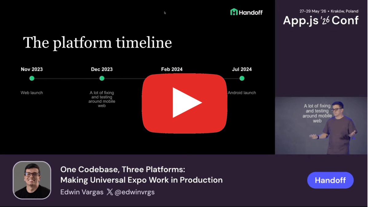
The setup was committed in November 2023. By March 2024 — four months later — they were live on web and iOS. Android followed in July 2024.
Architecture Pattern 1: Platform Adapters
The most reusable pattern was using platform adapters to isolate third-party library differences behind a shared TypeScript interface.
The problem this solves: many libraries have separate web and native SDKs with different APIs. Without a deliberate structure, platform conditionals bleed into business logic and components.
Their approach:
Step 1 — Define a shared interface
Step 2 — Implement per platform using Expo's file resolution
Step 3 — Consume the shared interface everywhere
Expo's platform-specific file resolution (.web.ts / .native.ts) handles the correct import at build time. No runtime conditionals in consuming code.
Edwin noted this pattern extended beyond analytics. They used it for push notification permission flows (iOS vs. Android have meaningfully different permission APIs), storage libraries, and several other third-party integrations.
Architecture Pattern 2: Route-Level Platform Separation
The router is the right place to make large-scale layout decisions between platforms. Handoff uses Expo Router, which supports platform-specific file suffixes natively.
Key insight from Edwin: mobile web is effectively a fourth platform. A route that serves iOS and Android does not automatically serve mobile web correctly. You can have a web route that handles both desktop and mobile-web breakpoints, and a separate native route for the app, all resolving to the same URL/path.
Example structure:
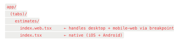
The web file handles the responsive split internally:
tsx
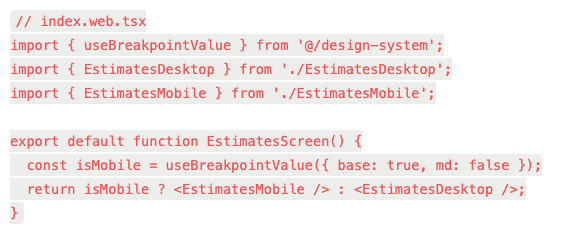
The native file gets a simpler implementation without the breakpoint logic, and the bundle for native doesn't carry any of the desktop web code. Edwin noted this had a meaningful effect on native bundle size — platform-specific files are tree-shaken from the opposite platform's build.
Architecture Pattern 3: Design System as a UI Adapter
Rather than scattering Platform.OS checks through component code, Handoff's design system components encode platform behavior internally.
Two examples from the talk:
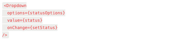
Dropdown component
- Desktop web renders as standard dropdown menu
- Mobile web renders as bottom sheet
- iOS / Android renders as bottom sheet
Dialog / modal component
- Desktop web renders as centered modal overlay
- Mobile web renders as bottom sheet
- iOS / Android renders as bottom sheet
The calling code in both cases is identical across platforms:
tsx
The bottom sheet on mobile web is the hardest component to get right. The team went through three bottom sheet implementations before landing on one that worked reliably. The Software Mansion team's new bottom sheet component would have been the first choice if it had been available earlier.
The design system also handled a more nuanced case: global search. On desktop, it opens as a modal. On mobile (web and native), it pushes a new screen. That routing decision is encoded in the design system component, not at the call site.
Trunk-Based Development + Expo OTA Updates
The team ran trunk-based development: every merge to main deploys to production. No release branches, no staging gates for normal feature work.
For web, this is standard. For mobile, it's only viable with a solid OTA update strategy.
Handoff used EAS Update (Expo Application Services) for over-the-air updates. The deployment flow:
- PR merged to main
- Web deploys immediately
- EAS Update publishes a new JS bundle to the OTA channel
- Mobile users receive the update on next app launch (or background update, depending on config)
- Periodic store submissions for native layer changes (new native modules, permission changes, etc.)
This compressed the feedback loop significantly. A fix merged at noon could be in front of web users within minutes and mobile users within an hour without waiting for an App Store review cycle.
The practical benefit: trunk-based development exposed cross-platform bugs faster.
Because web shipped continuously, the team caught rendering inconsistencies between web and native in hours rather than days. Testing on web often surfaced issues that would have shown up on iOS regardless.
The Facebook In-App Browser Problem
This was the most operationally interesting section of the talk.
When the team launched, they used the web version of the app as the landing destination for Facebook ads.
The flow: User clicks ad → lands in Facebook's in-app browser → sees the working web app → converts.
No app store redirect, no install friction.
It worked. But the in-app browser turned out to be inconsistent depending on where in the ad the user tapped. Some tap targets opened a Chromium-based browser; others opened a different WebView with different behavior. In the non-Chromium variant, browser chrome was overlapping the app's navigation UI.
The fix required browser detection and conditional style overrides. Edwin showed a real code comment from their engineer Jan documenting the investigation — the kind of comment that only gets written after a painful debugging session.
They then ran an experiment: could they redirect users out of the in-app browser into their default mobile browser to get a more consistent environment? The A/B test showed it hurt conversion. The in-app browser, despite its bugs, kept users in a tighter funnel. Moving them outside of Facebook's ecosystem introduced enough friction that fewer users completed the flow.
The conclusion: stay in the in-app browser, handle its quirks with conditionals. The broader lesson Edwin drew: mobile web has its own surface area that deserves explicit attention, not just an afterthought treatment as "web but smaller."
Production Metrics
Edwin showed internal team data. The numbers are for front-end-focused engineers on the Handoff team (engineers with the highest commit volume to the front-end codebase):
- Average PRs merged per month: ~106
- PRs merged in April 2026 = 131
- Average PRs per front-end engineer per month: ~40
- Average time from first commit to merge: ~7 hours
A ~7 hour commit-to-merge cycle across a codebase that spans three platforms is notable. It's a function of the trunk-based approach (small, frequent pull requests rather than large batches), the OTA update path (no store review blocking merge), and keeping platform differences isolated in adapters and design system components rather than distributed through business logic.
What They Actually Shipped
Two features were complexity benchmarks:
Estimate table — a full spreadsheet-style table with drag-and-drop reordering for both individual line items and groups. Implemented across desktop web, mobile web, and native. Drag-and-drop on mobile web was another painful implementation — he flagged it similarly to the bottom sheet.
Gantt chart — a timeline/scheduling view, desktop only. Edwin made a point of showing this explicitly: you are not constrained to mobile-form-factor UI just because the codebase is React Native. Universal Expo doesn't mean everything needs to look like a mobile app. The Gantt chart shares route infrastructure with native (the sidebar nav on desktop uses the same interface as the bottom tab bar on native) but renders a completely different, desktop-appropriate UI.
Summary
The core engineering decisions that made this work in production:
- Adapter pattern for third-party libraries — define a shared TS interface, implement separately per platform using Expo's file resolution, keep platform knowledge out of business logic
- Route-level platform separation — use .web.tsx / .tsx suffixes at the route level for major layout differences; let the web route handle its own breakpoint logic
- Design system as a UI adapter — encode platform-specific rendering (bottom sheet vs. dropdown, modal vs. full-screen) inside design system components, not at call sites
- EAS Update + trunk-based development — treat mobile closer to web by removing the store review cycle from the normal deployment path
- Treat mobile web as a first-class target — it shares neither the iOS/Android native environment nor the desktop web environment; it needs its own explicit handling
The tradeoffs are real. Bottom sheets on mobile web are hard. Facebook's in-app browser required conditional workarounds. Drag-and-drop across platforms required significant implementation work. But the team shipped three platforms from one codebase, iterated at ~40 PRs per engineer per month, and maintained a 7-hour commit-to-merge cycle.
Edwin's framing at the end was direct: the point of Universal Expo isn't code reuse for its own sake. It's that one codebase creates one feedback loop, and a faster feedback loop is what lets a small team compete.
Edwin Vargas is a software engineer at Handoff. This post is based on his talk "One Codebase, Three Platforms: Making Universal Expo Work in Production" at App.js Conf 2026. Watch the full talk on YouTube.